UNIVERSITY PROJECTS
D&AD Competition - Durex
For D&AD’s 2019 design challenge I chose the Durex brief. Durex are one of the best known condom brands in the UK. They are very centered about sex education but believe in making it fun. People are feeling more pressured and anxious than ever before when it comes to sex, especially young people. Durex aim to be the liberator of good sex. They believe good sex is a human right and they’re on a mission to break the conventions, providing the products to liberate everyone to have the sex they want on their own terms. The highest rate of STD diagnoses is in 16 to 24 year olds. They asked for a way to galvanize 16 to 24 year olds to stand up for the right to protect themselves and make carrying protection a normal thing. “Just like making a cup of tea or brushing your teeth.” Durex wanted the campaign to steer away from stereotyped imagery and puns and rely on strong imagery. Durex position themselves as a liberator and ally to the sex that people want. Therefore, the idea shouldn’t frighten, bull or scaremonger people into using them.
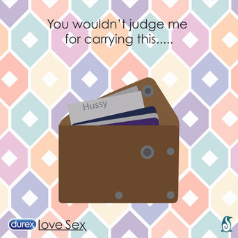
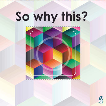
Within this brief I choose to re-design the packaging to allow them to be personalized and quirky. By having a item that could be personalised and patterns added allowing them to be used to start a conversation in sex education classes. The packaging could therefor be placed on a shelf or bedside table and be hidden in plan sight or more likely stand out. The individual wrappers would also look less like boring condoms by using bold patterns and designs which wouldn't be as recognizable but would also start a conversation if seen or used. This was also accompanied by a social media campaign calling into question what everyday objects don't receive comments for being used or carried compared to condoms.
YCN Competition -
Artfund_
One of YCN's 2019 briefs was Artfund_. The brief was given to encourage students on all courses to begin visiting museums and gallery spaces. As a method of stepping out of their lives that are consumed with exams and essays and getting a new perspective on the world and their lives. The idea that for many of them it may act as inspiration where as for others its the idea of a change to relax and rest. It may even be a way to socialise in different groups to there usual ones. The campaign should challenge people yo discover a variety of experiences and values and education that museums and galleries offer.
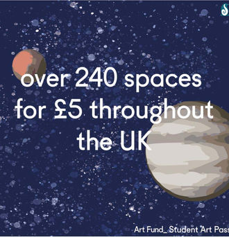
I wanted to target two main areas young people at Universities would be seeing regularly, Social Media and their hall of residence themselves. So 3 sets of 4 social media posts where made when pieced together had similar images to the door stickers. The door stickers where made to give the idea that stepping out of your room door and going to one of these places to escape from the stresses of university life. The typography was also designed to have the look of it floating and interacting with the "World". The option to also add wall stickers to allow for the door to look like it's struggling to hold the world with cracks and crumbling plaster. University rooms are normally very boring and bland and there are lots of rules about what you can put up on the walls where so this would really enhance a lot of rooms.
Penguin Books Competition -
Naughts and Crosses
Penguins student design awards in 2010 for the Children's fiction category was Noughts and Crosses by Malorie Blackman. The brief asked for a image based cover. I choose to use a dark blue background with bright pink writing. Using a naughts and crosses pattern over the front over and the back cover had the final news article in the book. This article contains all the information on what happened to the characters, which played on the fact that maybe you should judge this book by it's cover. I also choose to illustrate the main characters hands with their tattoos of their sides on their fingers joining together to create a heart, reflecting the storyline subtly as the cover.
Ryanair
One group project I undertook in my second year was to tackle Ryanair's branding (Was a in-house project not affiliated with Ryanair) As a Group we choose to re-brand the company for 3 main reasons:
-
Firstly their manifesto didn’t match their actual attitudes and company values. They were contradictory and condescending. The idea of them being a friendly, simple, low price point option needed to be central to the brand.
-
Secondly the logo and colour scheme needed changing. The logo itself was very hard to make out and undesirable. The colour scheme also made the brand look very cheap, almost bargain basement.
-
Thirdly they claim to be simple, yet they employ lots of hidden costs. So the brand needed to become more transparent and honest with their customers.
I took on the physical object design work: I had 4 colours to work with and used these to create 4 different colour ways and designs for the main pattern design. I felt that using the logo was important, as it needed to be clear that all the products and items were Ryanair’s. I wanted to make it a repeated pattern to allow it to be used on seats and the neck-wear of the uniforms. The plane design was also carried out to look more sophisticated and yet still simple. The Cutlery design was also something I felt was important as they are widely used. The design I decided to produce was a rounded, simplified design. The spoon and the fork were the same size and shape with the prongs cut into the fork and the spoon hollowed deeper. The idea of making them out of either bamboo or wood meant they could be recycled, yet still light enough to not cost extra to transport them, making a big difference on the environmental impact. .
A-Level Work- Woodend Creative
During my A-Level Graphic Design course I choose to work on a brief for Woodend Creative. I created a number of things for the project including a business card, poster, and article. The idea was to advertise what Woodend was and how it was a hub of activity that many people didn't know existed. From this project I then began Volunteering there and eventually worked there for over a year and a half.


